
Platform
 Overview
 Integrations
Use Cases
Many Possibilities. One Platform.
 Marketing Changes
 Cross - Platform
 Everything
 Budget Allocation
AI and Automation
The Always-on Incrementality Platform
 Explorer
 Analyst
 Geolift
 Actionable Insights
 Media Mix Modeling
Solutions
Teams
Built for your whole team.
 Growth Marketers
 Marketing Analysts
 Data Analysts
Industries
Trusted by all verticals.
 Gaming & Entertainment
 Fintech
 Travel & mobility
 Lifestyle
 eCommerce & Retail
 Healthcare & Clinical Services
 Agencies
Mediums
Measure any type of ad spend

People throw the term “Saturated” way too often: “my audience is saturated in this market”, or “I can’t scale Google – It’s Saturated”, but Saturated is often misunderstand as a channel or an audience that’s completely “tapped out”, while Saturated has a completely different meaning.
Saturated is perceived as a sold-out stadium. No seats left. Nothing more to buy. Come back next year.
But if your Stadium is Google, or Meta, or TikTok, or a Programmatic DSP…Those did not run out of people. Meta practically has unlimited inventory. TikTok has plenty. Google has more searches than you will ever afford. What actually happened is far less dramatic and far more expensive:
The next customer got expensive. Saturation is a statement about price, not about supply. Once that clicks, saturation curves stop looking like a data science flex and start looking like the most useful chart in your media plan.
A restaurant has 40 seats. Friday at 8pm, every one of them is full, at full price, no discounts, all good.
Now it's Tuesday at 9:30pm. Twelve tables are empty. There is inventory. Nobody is turning anyone away. But to actually put a person in table 29, you need a 20% off coupon. Table 35 takes 40% off and a free dessert. Table 40 takes a deal so aggressive that you are basically paying someone to come eat your food.
The restaurant never ran out of tables. It ran out of people willing to show up at the current price.
And here is the part that matters. If you look at the restaurant's average revenue per diner across the week, it looks fine. It's diluted by the Friday crowd who paid full freight. The average tells you nothing about what table 40 cost you. The average is a story about the past. Table 40 is the decision in front of you.
Every channel you buy works exactly like this.
Every KPI you’re reporting on can be seen through two lens – the average of that KPI, and the Marginal of that KPI. Most marketers only ever see the first one.
Average CPA is total spend divided by total conversions. It's a blend. It mixes the cheap conversions you got early with the expensive ones you scraped for at the end, and it hands you back one comfortable number.
Marginal CPA is what conversion number 101 costs, given that you already bought 100.
Notice something: you never actually make a decision about the average. You can't go back and re-buy last quarter's conversions. Every real decision - raise this budget, cut that one, move $5k from here to there - is a decision about the next dollar. Which means it's a decision about the marginal returns, whether or not anyone in the room said the word.
Here's the gap between those two numbers across the accounts we measure:
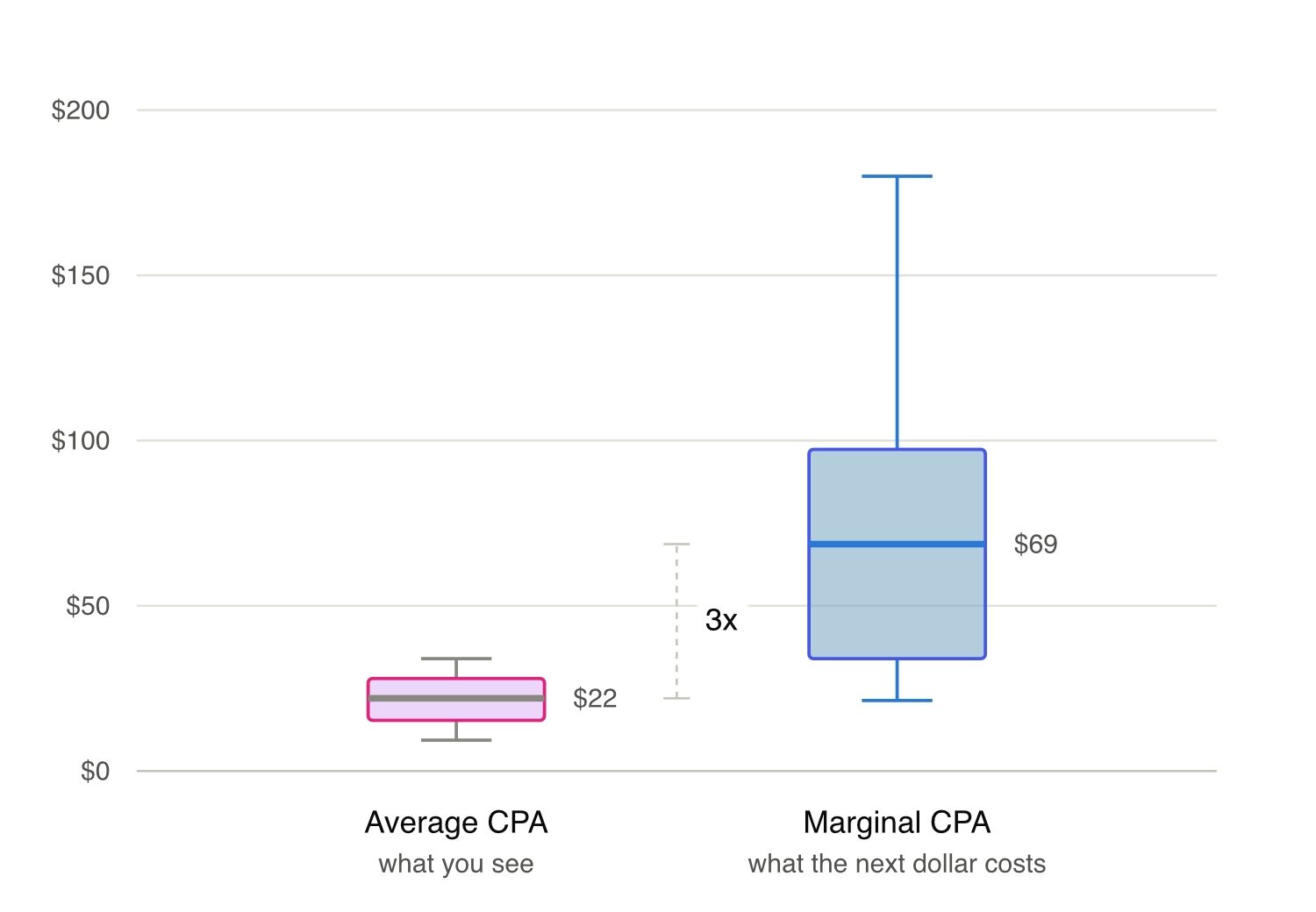
Median average CPA: $22. Median marginal CPA: $69. Three times higher.
But look at the shape, not just the medians. The average CPA box is tight. Everyone clusters between roughly $8 and $35, which is exactly why average CPA feels so reassuring and so comparable. The marginal box sprawls from about $20 to $180.
Averages compress. Marginals reveal. If your channels all look similar on a dashboard, that is not because they are similar. It's because you are looking at the number designed to hide the differences.
Saturation curves is a picture of how the price of your next customer changes as you spend more.
Left to right: daily spend. Bottom to top: what the next conversion costs at that level of spend. The dot is where you are sitting today.
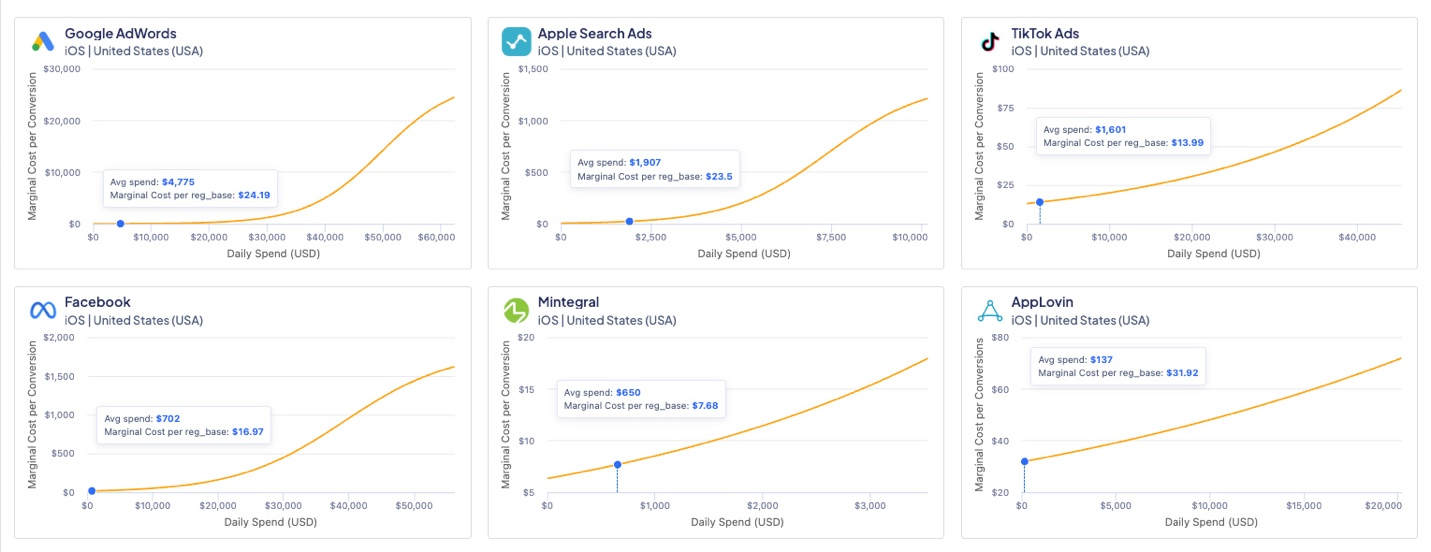
(source: INCRNTAL Explorer, Functions view)
That's it. Every point on the line answers one question: if I were spending this much per day, what would the next registration cost me?
You'll sometimes see the same information drawn the other way around, as a curve of conversions that flattens out as spend grows. Same data, different angle. The flattening response curve and the rising cost curve are two views of one fact: the more you buy, the more each additional unit costs. We plot the cost version because it's the one you can act on. "The line is flattening" is an observation. "The next reg costs $31.92" is a decision.
Look at two of those charts side by side.
Google AdWords is running at $4,775 a day. The next registration costs $24.19, and the curve stays basically flat until around $30,000 a day. There is an enormous, boring runway ahead of it.
AppLovin is running at $137 a day. The next registration already costs $31.92, and the line is climbing from the very first dollar.
Saturation has nothing to do with how big your budget is. It has to do with the shape of the curve under your feet. A channel can be saturated at $137 a day. Another one can be wide open at $50,000.
There are four powers happening all at once causing your marginal returns to diminish:
You buy the easy conversions first. The ad platform algorithm is not saving the high-intent users for later. It finds them immediately. Every conversion after these is, by definition, less likely to convert.
Frequency stops working. The same person seeing your ad 14 times is not 14 people. At some point you're not buying reach, you're buying repetition.
Auctions punish ambition. To reach more, you bid higher. And you don't pay the higher price only on the new users you unlocked. You pay it across the board.
You start paying for people who were coming anyway. This is the one that hurts most. As you push more budget into a channel, an increasing share of what it reports were conversions you would have gotten regardless - from organic, from a different channel, from a customer who had already decided. Attribution happily claims every one of them. Your average CPA stays flat, but your marginal CPA is climbing up the curve without you seeing it.
That last point is really the whole argument for measuring incrementally. A saturation curve built on attributed conversions will lie to you politely, right up until you have wasted significant budget on it.
One rule covers most of it:
Budgets should not move from the channel with the worst average CPA to the best. Those comparisons are between blended historical numbers, and blended historical numbers do not tell you what happens to the next dollar.
Money should move from the channel with the highest marginal cost to the channel with the lowest, until they meet in the middle.
If (for example) TikTok's next registration costs $13.99 and AppLovin's costs $31.92, the trade is not a debate. It's arithmetic. And it is completely invisible on a dashboard reporting blended CPA, where both channels might look like perfectly respectable $20 performers.
You stop moving money when the marginal costs equalize. That's the optimum. Deeply unglamorous, entirely correct.
A saturation curve is a snapshot of a specific channel, with specific creative, aimed at a specific audience, in a specific week. Change any of those and you redraw the line.
New creatives re-shape the curve. Which is why "we maxed out Meta" is, nine times out of ten, a creative problem wearing a media costume.
So the next time someone tells you a channel is saturated. Ask one question: At what price?
If they can't answer that, they don't mean saturated. They just mean tired / exhausted / fatigued.
 iOS
iOS Android
 Web
Web TV
TV Influencer Marketing
 Out of Home
 In game
 Podcast
 About Us
 Contact